PTS

Brand & web

The speed read

A strategic rethink and creative rebrand, to bring clarity to the PTS offering, as well as to drive membership sign-ups.

  • PTS had little brand recognition or penetration in a crowded market.  Their comprehensive offering was part of the problem: based on an advanced platform that offered travel sellers everything from booking to card acquisition, the offer was muddy and unclear.

  • We realised that a strategic change was necessary; from focusing on the minutiae of the PTS offering, to a benefit-led approach that spoke to every travel-seller’s deep need to overcome the complexity and uncertainty inherent  in every booking. Our big idea? For Travel’s Sake.

  • While they are a solutions business – not a travel company – PTS still exists to facilitate safer and securer trips for every travel-seller’s customers. So, we worked with  a skilled illustrator to develop a suite of assets that spoke to travel sellers, while evoking a golden age of travel.

  • Our approach represented a step change for PTS – setting them apart from the competition by focusing on key user benefits in a bold and beautiful campaign designed to capture the hearts and minds of the travel industry, as opposed to the dry, technical stances of competitors.

...got some more time?

What was the problem?

PTS had little brand recognition or penetration in a crowded market. Their comprehensive offering was part of the problem: based on an advanced platform that offered travel sellers everything from booking to card acquisition, the offer was muddy and unclear.

PTS already showed up as a friendly and personable business, with a market leading Trust Account product and a great software platform. We wanted to keep that friendly, supportive vibe, but take it further than it had ever gone before.

What was the big idea?

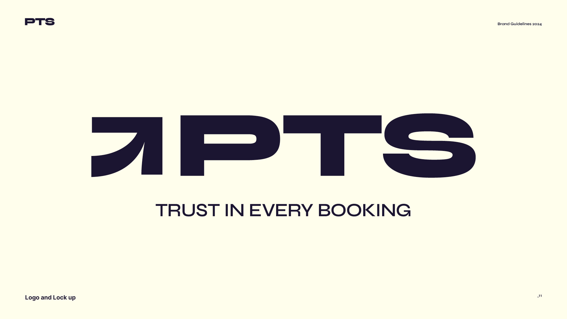
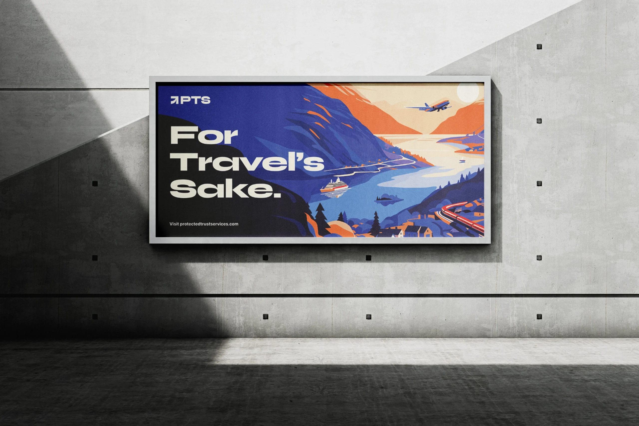
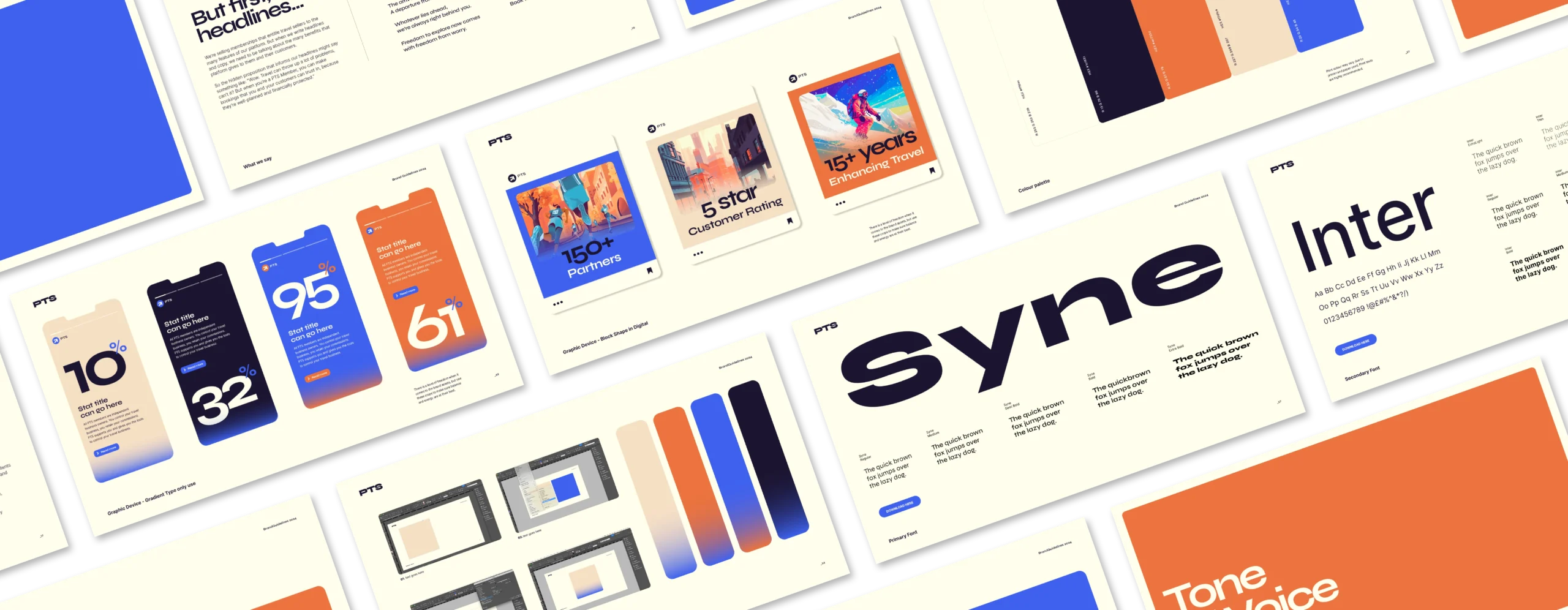
PTS had already rebranded from Protected Travel Services to Protected Trust Services, to draw focus to its hero offering. However, they fully embraced the need to re-imagine everything else, with a new brand logo and an evocative illustrative style that would now underpin every asset.

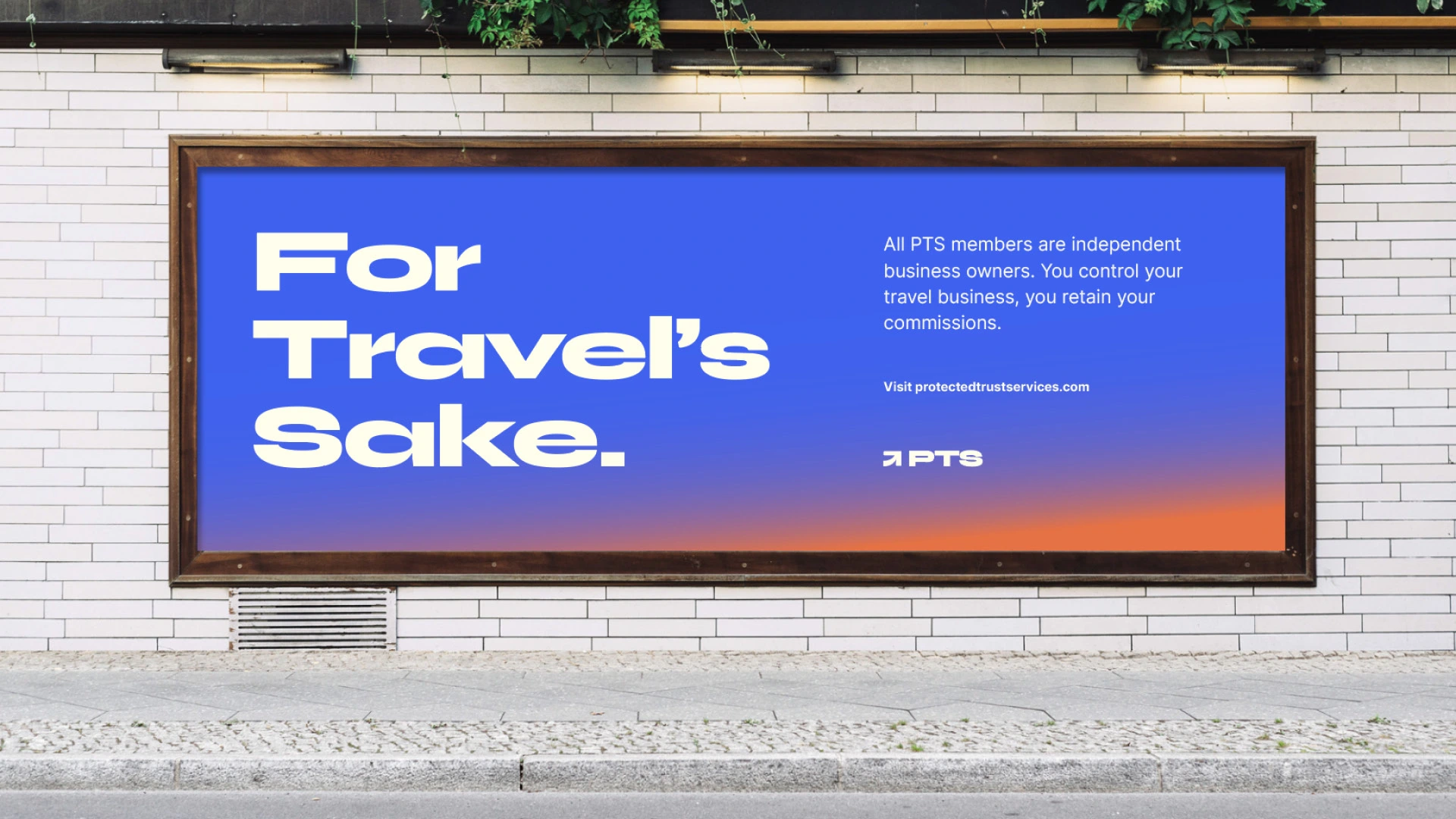
Travel sellers live in a world of uncertainty. Airlines can go bust. Air traffic controllers can strike. Hotels can turn out to be building sites. And when it goes wrong, they’re left to pick up the pieces or disappoint paying customers. PTS enables them to make sure every booking is protected in any event, promising peace of mind for them and their customers. They need to join PTS:

For travel's sake*

What was the process?

Independent travel agencies, consortiums and tour operators struggle to meet customer needs effectively, either through the deals they have with their suppliers, the quality and integrity of insurance and cover provided to holiday packages and the fragmentation of the type of holidays customers buy. 

This leads to poor service, customers being stranded or losing out on finances leading to a poor perception on travel agencies as a whole. With PTS’ all-in-one travel management platform, travel businesses can reduce costs, gain more control and, most importantly, protect their customers and their business. 

  • Our first step was to review product positioning, tone and visual language of key competitors, to understand the language of the category, and carve out white space to help land our new positioning.

  • Interviewing team members across multiple roles including founders, sales, customers giving us a holistic view of customer needs and requirements, company culture and ways of working.

  • Using our proprietary workshops, we identified behaviours, values and tone of voice prompts that best reflected our new positioning and culture of PTS.

  • Finally, we brought all our thinking together to develop a brand narrative, messaging pillars, values and behavioural guidelines to inform the visual brand, web development and go-to-market strategy.

What was the creative solution?

  • Creative copy

    First and foremost, we realised that by making our headlines focus on end user benefits, we needed to make sure that our membership signup objective wasn’t getting lost in translation. So we paired every headline with an explanatory subhead,in a lockup designed to ensure clarity. We were then able to focus on creating more eye-catching and benefit-focused headlines, secure in the knowledge that our ‘lockup’, body copy and ‘For Travel’s Sake’ strapline completed the story.

    Copy example: Wanderlust should always be free from worry.PTS members get to send every client away happy; secure in the knowledge that their trip is covered by both Trust Account and ATOL protection. If you want freedom from worry for you and your clients, talk to PTS today.

  • Visual identity

    Our Brand identity is how we show up in the world visually.A stand out identity is essential for recognition and establishing a strong and cohesive brand image. For PTS it was important to develop a brand which stood out from not only their competitors, but, stood out full stop. When researching we realised very quicklythat boring over used stock imagery seemed to be a firm staple to most of PTS’s competitors identity’s and was the reason these sites were forgettable and stale. 

    We knew wecould change this through our creative choices and that there was another way to deliver PTS’s visual message. We needed consistency, memorable impressions, whether audiences encounter the brand through a logo, website, marketing materials, or any other visual representation but without the use of any stock. The answer was Illustration, bold colour, characterful typography, animated detailing and a strong reliable logo.

  • Digital & web

    Web is changing. Our approach to this project embraces that change with a seamless integration of strategy, digital design utilising our bespoke brand illustrations to deliver a standout online experience in the sector.

  • Events & marketing

Let’s talk.

+44 telephone number

141-145 Curtain Road, Shoreditch, London.